Website redesign based on user research
6 min read
Context
From January to April of 2018, I worked on a study case to improve CERTI's Foundation website experience and the following is a sample of that work. While not everything has been shipped, the core ideas represent the desire to reach users' needs. The scope of work included site mapping, desk research, user research, prototyping, and developing a basic component system.
- Timeline
- January - April 2018
- 12 weeks
- My role
- UX/UI Designer
- Team
- Larissa Beiró
- UX/UI Designer
- Maiara Camillo
- UX Research Master
Challenges
- The website had to meet various client demands, which led to a confusing identity
- A 3-month deadline was given, which seemed short considering the size of the project and my expertise at the time.
Objetives of the project
- Identifying the needs of the personas.
- Maintaining brand identity so users could easily recognize the website despite changes.
- Facilitate access to frequently used pages
- Enhance comprehension of displayed information.
Process
To lay the groundwork for the project, I utilized the Double Diamond approach, concentrating on the initial stages (Discover, Define, Develop). Because of time limitations, we opted to share the proposal with the stakeholders before proceeding with the usability test.

Empathize
User Research
To delve into users' website-related frustrations, we employed the SUS (System Usability Scale), conducting interviews with 20 participants. And in parallel I did an Usability Analysis based on Jakob Nielsen's 10 Usability Heuristics.
Insights
In collaboration with another UX researcher, we translated users’ answers into pain points along the journey, which I use to inform deliverables on the interface.
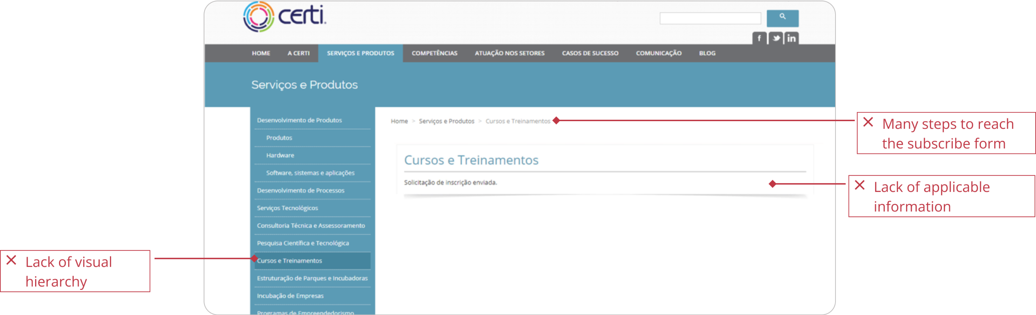
- ”I feel overwhelmed by the number of clicks I need to do to see the main informations”
- ”Lack of visual information” (e.g. images, videos and more colors)
- It didn't met the usability heuristics
Ideate
Actions
- Establish a color scheme to each section and image guidelines to improve visual information
- Improve the Subscribe journey by simplifying the path to conclusion
- Align the website with the 10 usability heuristics
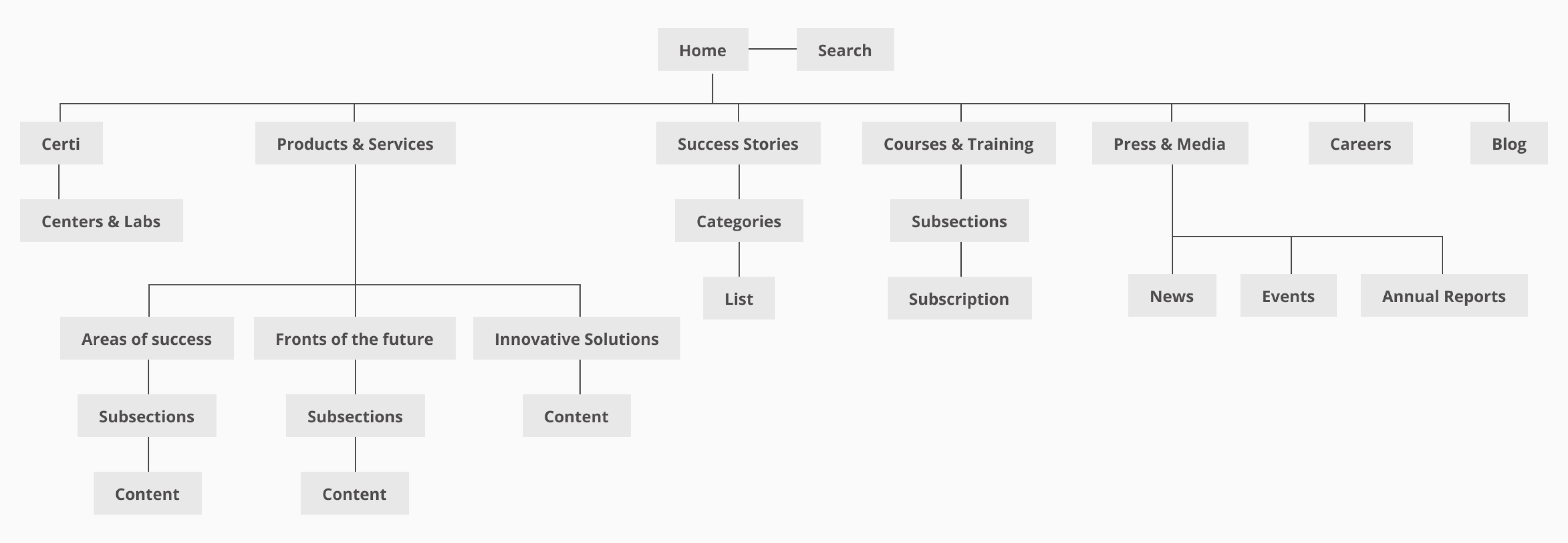
Sitemap
To better visualize the necessary screens, I crafted a sitemap defining the website's primary information architecture. This also facilitated on acting assertively giving the short timeframe the project required.
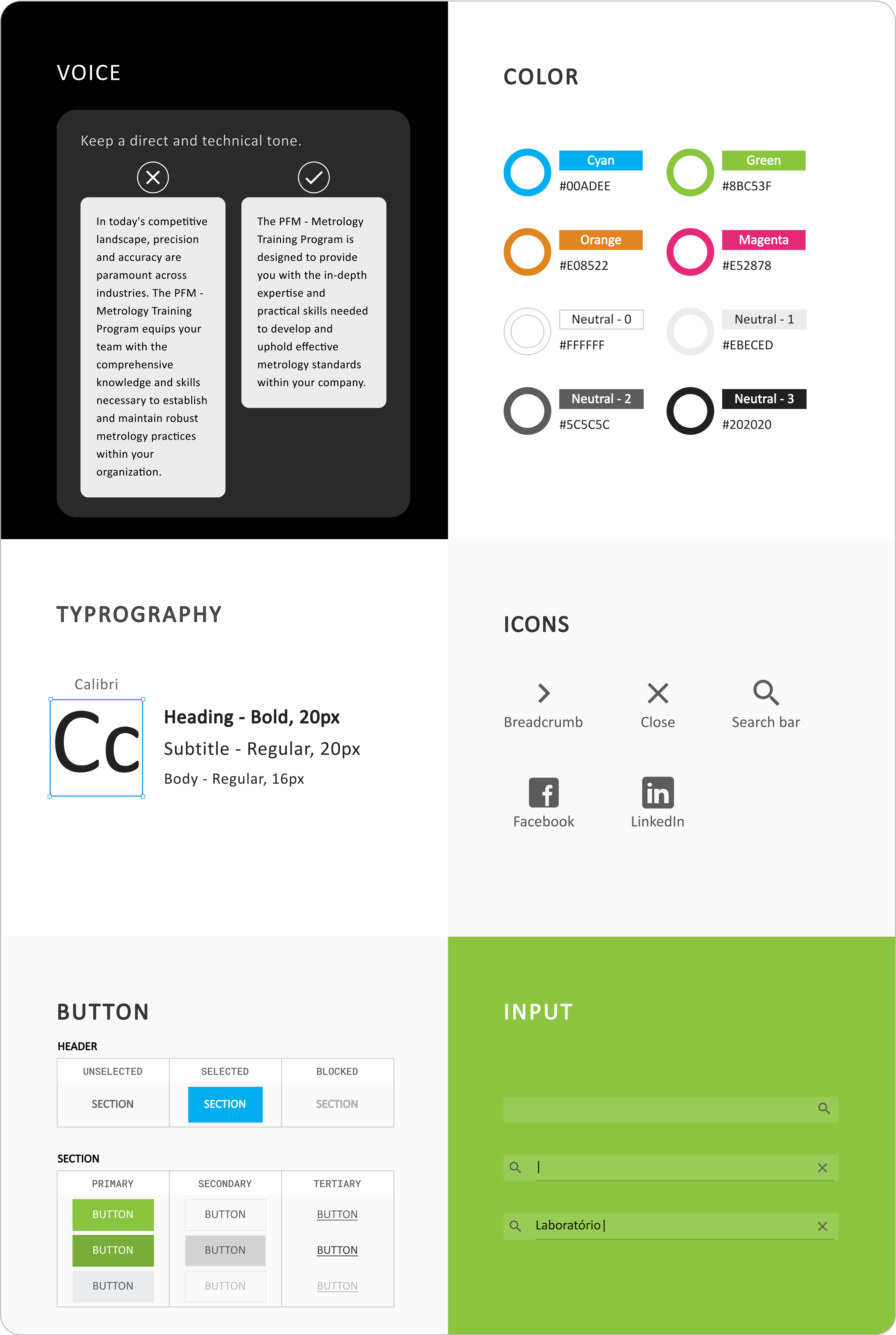
Visual Design
To ensure scalable maintenance and adhere to CERTI Foundation brandbook, I have documented all website guidelines into a style guide. So we guaranteed an easy implementation of changes and addressed potential data growth. See a part of the results below.
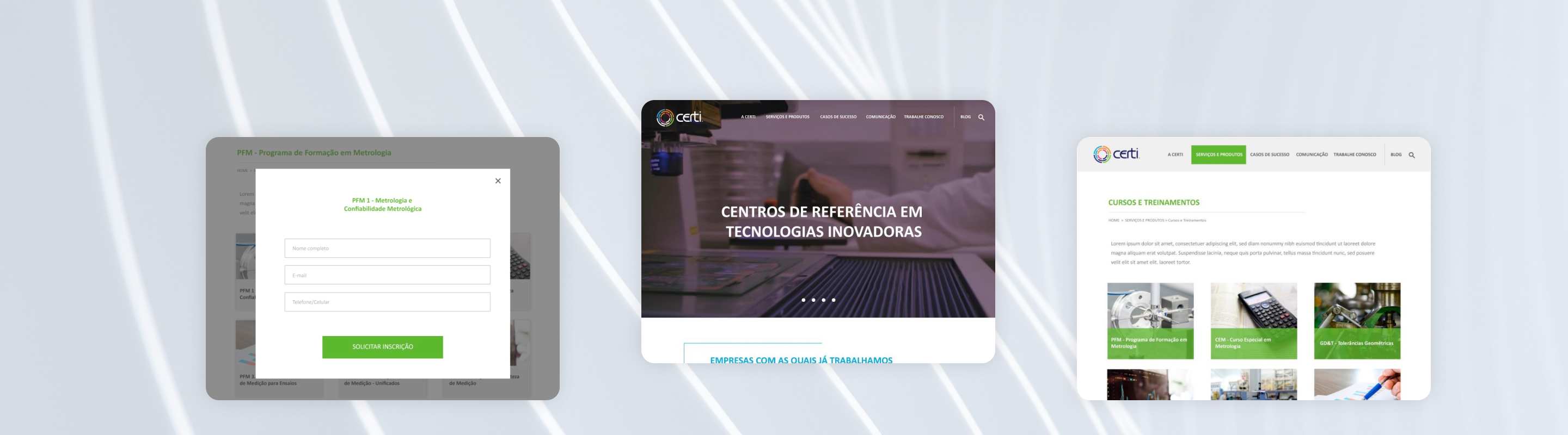
Outcomes
Old page
New page
Other improvements
Color scheme for each section
- Gave status visibility with a page indicator on the menu - using the brand colors
- Improve the visibility of the user's current status

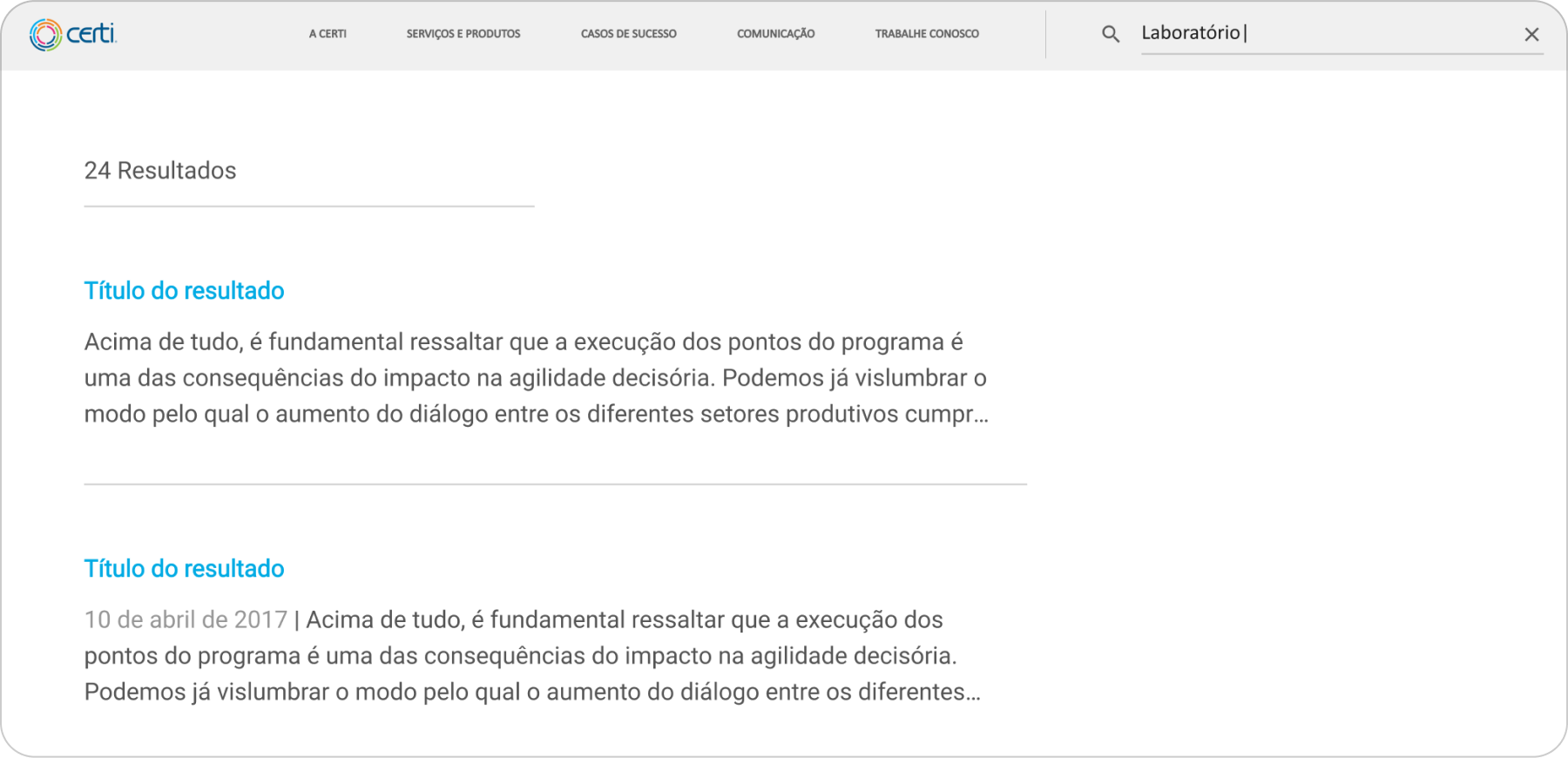
Search engine
- More efficient method of finding information with a search bar
- Encourage users to explore information on the website before exiting
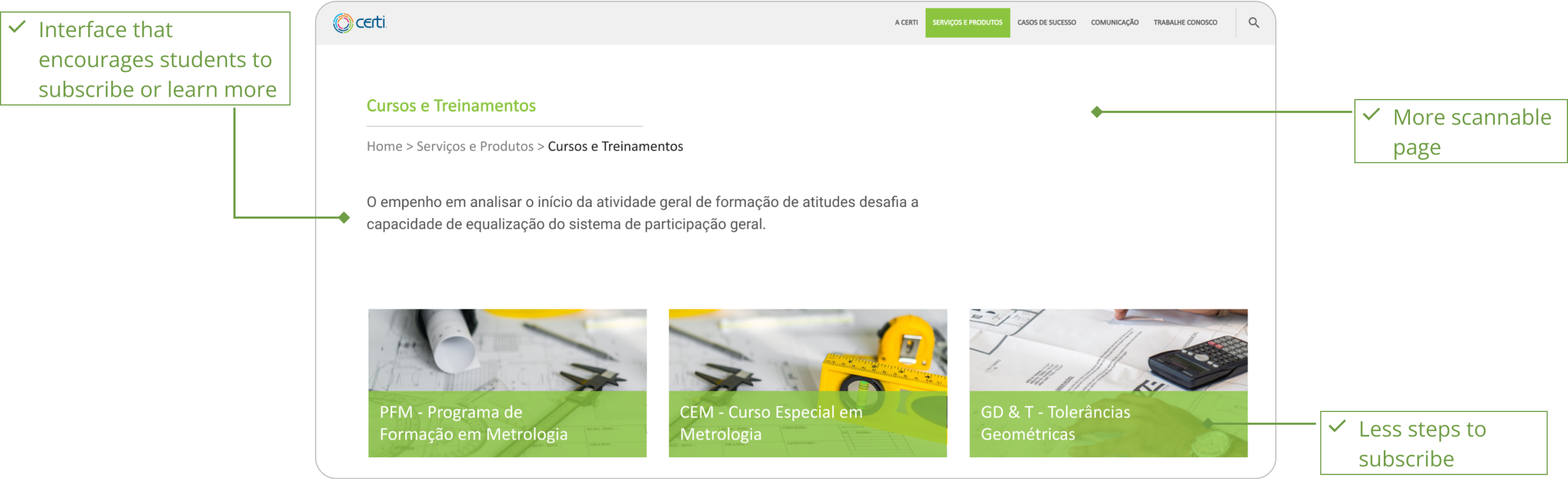
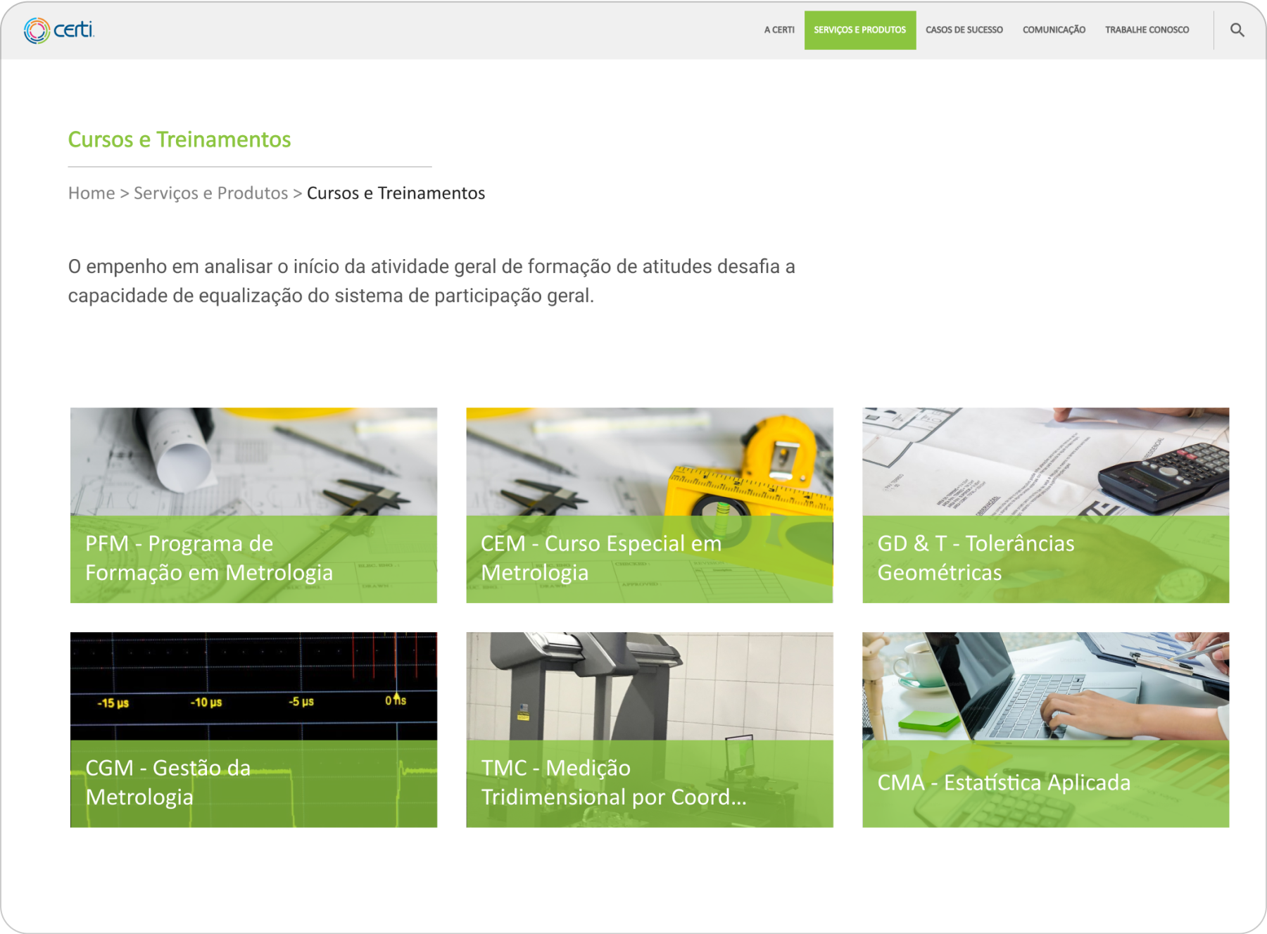
New Courses page
- Eye-catching course cards with images that spark students’ curiosity
- Make it easier for students to consume information about ongoing courses
- Potentially increases subscriptions
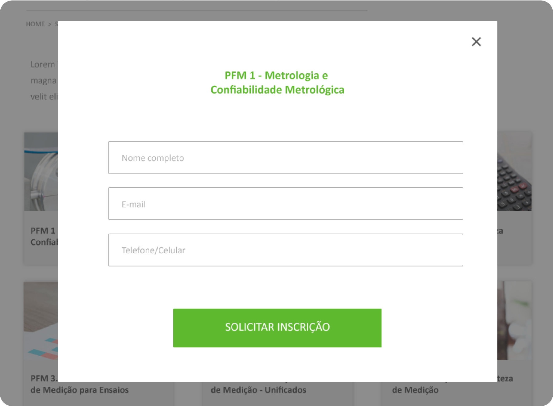
New subscription form
- Shorter subscribe flow
- 4 clicks vs. 2 clicks (previous vs. updated)